
How to Start an Online Store
Starting an online store has advantages over having a physical storefront: there's no rent to pay, and you can reach millions of customers from the comfort of your own home. To have a shot at success, however, it's a good idea to put as much thought into starting an online store as you would for any other business. You'll need a great product, a user-friendly website, and a solid marketing plan. Read on to learn how to get started.
#1 Developing Your Product and Business Plan
1) Decide what you want to sell
If you want to start an online store, you probably already have an idea for a great product to sell. Keep in mind that certain things are conducive to selling well online, while other items may be more difficult to sell when they can't be viewed in person. In any case, you should believe passionately in the value of your product - otherwise, it will be hard to connect with customers. Here are some questions to consider:
- Is it a physical product that needs to be shipped, or is it a digital product that can be sent through the Internet?
- Are you going to have an inventory (more than one) of each product, or will they be one-of-a-kind (e.g. artwork, vintage items)?
- Are you going to want to sell a wide variety of products, or do you plan to specialize, like selling just t-shirts or books?
- Are you creating the product yourself? If so, make sure you'll be able to keep up with demand. Form a relationship with a reliable supplier.
- If you don't plan to make the product yourself, you'll need a good manufacturer. Research different companies to find the one that works for your business idea.
- Decide how your product will be shipped. Create a plan to ship the product from your home efficiently, or work out a storage and shipping plan with a warehouse. You could also look into drop-shipping if the product is being manufactured by a third party.
- You are going to be intimately involved with your product or service. In order to effectively spread the word and market your store, you are going to need to socialize with people from this industry. Make sure the product is something you can get behind for the long haul.
2)Find a niche
Knowing what product you want to sell is only part of creating a successful online store. You'll need to figure out what differentiates your services from all the other similar services people can choose, both in person or online. Why should a customer buy your hand-knit sweaters when they have 100 other online shops to choose from?
- Size up the competition. Don't just jump into selling a certain product line until you've looked at the websites you'll be competing with. Consider the main online marketplaces you plan to advertise your products; and check out the competition within those portals.
- Offer something truly original. If you're selling handmade crafts or works of art, the originality of your work may itself be the draw that sets your product apart. Try to strike a balance between something that is highly original and also has general appeal.
- Offer expertise. Perhaps the quality that sets your company apart from the rest will be your expertise on the type of product you are selling. Maybe you're a former baseball pro selling a line of baseball gloves, for example. Make your passion and expert knowledge part of the package.
- Offer a user-friendly purchasing process. Even if your product is very similar to other things for sale online, you can set your store apart by making the shopping experience fun and easy. Make sure your website is easy to navigate and fun to share. Be responsive and provide great customer service where others don't.
3)Test the waters by selling your items on a small scale
In the real world, it'd be wise to try selling your products through other, low-commitment avenues (consignment, flea markets, craft shows, etc.) before taking the plunge and starting an entire store. The same is true for selling online. Try selling your items individually on eBay, Craigslist, Electronics, Cars, Fashion, Collectibles & More | eBay and the like. Here's what you'll want to look for:
- Who is buying your product? Offer a discount coupon or free gift if they answer a brief survey. Find out where else they shop online.
- How much are they willing to pay? Experiment with different prices.
- How is customer satisfaction? This is a good time to test how well you can get your product to the customer. Are you using good packaging? Is the shipping method reliable? Are they happy with their product? Did you describe it well?
4)Make a business plan
Before you start the process of opening your online store, take the time to draw up a detailed business plan, whether or not you're planning on getting outside funding from investors. It will help you plan the steps you'll need to take to make your business successful. Figure out your cost of operation and map out a marketing strategy. You'll want to take these factors into account:
- Production costs, whether you're creating your product yourself or contracting with a manufacturer.
- Shipping costs.
- Taxes.
- Employee wages, if applicable.
- Fees for reserving your domain name and web hosting service.
5)Register your business according to your state's laws
When you're ready to make things official, you'll need to come up with a business name and fill out the necessary legal and tax paperwork to register your business.
#2 Building Your Own Online Store
1)Register a domain name
Choose a name that's short, catchy, and easy to remember. It should also be unique since the most obvious names are already taken. Lookup a domain registration company and try different names until you find one that satisfies you and isn't already in use.
- If the name your heart is set on is already taken, get creative. Spell numbers out, add a small extra word, or try hyphenation.
- The domain registration service will provide suggestions for close alternatives if the name you want is taken.
2)Choose a web hosting service
It's worth finding a good service for your website since the site is the backbone of your online store. If it's finicky, sales will certainly suffer. Free web hosting services are available, but since you're selling products online, you'll need to pay for a service that offers the options you need.
- You'll need enough space for growth if your business does well.
- Choose a hosting service that allows for customization if you're planning on doing your own programming.
3)Design your website
Either design the website on your own or hire a web designer to create it for you. The emphasis should be on showcasing your product and making it as easy as possible for customers to make a purchase. Don't fall into the trap of making the website too flashy - the more straightforward, the better when it comes to online shopping.
- Include a way to gather email addresses, so you can send advertisements and special offers.
- The customer should have to make no more than two clicks to check out with a product.
- Choose just a few colors and fonts to use.
4)Choose e-commerce software
This allows customers to view products and make a secure purchase. The software stores customer information and financial information. In some cases, e-commerce software factors into marketing, since it can be used to send emails to customers. Take a lot of time to research companies before making a choice, since the one you choose will play a huge role in your customers' experience and your company's success.
5)Set up a merchant account
You'll need to set up an account with a bank financial institution so that your customers can pay with credit cards. Going with a bank can be pricey, so many small online store owners go with PayPal as a less expensive option.
#3 Using an All-Inclusive E-Commerce Service
1)Research all-inclusive e-commerce services
If you don't have the inclination to set up your own website from scratch, there are plenty of services that offer a platform for an online store you can set up in just a few hours, for a very low cost. This way you will not have to learn how to code or hire a web designer, and you'll have all the tools you need to start selling your product right away.
- All-inclusive services usually take a small cut from each sale you make.
- The services have benefits, but there are also limitations, since you have to operate within their systems. Get familiar with the different services before choosing one. If you don't find one that suits the business model you have in mind, reconsider starting a new online store on your own.
2)Consider general e-commerce services
Companies like Shopify and Yahoo! Stores will allow you to set up professional-looking online storefronts when you ship your own inventory. Hosted e-commerce solutions go further to provide storefront design, secure payment, hosting, mailing lists, selling statistics, customer support. This is attractive for those who don't want to do their own programming.
3)Look into reselling products for a profit
Affiliate store services such as Amazon eStores LLC allow you to resell products carried by http://Buy.com and other merchants by writing reviews of products and focusing on a theme that makes consumers' lives easier. Amazon eStores stores allow you to get running quickly, but don't allow you to carry your own physical inventory.
4)Take eBay to the next level
If you've already sold some stuff on eBay, and you're confident that most of your customer base will find you there, then you can "graduate" to an eBay store to save money on listing fees.
- If you haven't used eBay before, this approach may not be for you, since it's best to start with an existing customer base. Your customers will need to be web-savvy enough to feel comfortable using eBay.
- Note that eBay tends to attract people searching for bargains and one-of-a-kind items.
5)Consider Tips for general sales
Tips is an online marketplace where you can post one item or create an entire catalog for free. You upload some photos, describe the items, and price them to sell. It's free to post goods for months without having to update the listing. When the item sells and is $35 or less, it's a 5% fee. If the item is $35 or more, the fee is 3%. On top of putting goods up for sale, you can embed videos, blog about your products and services, and connect to your Twitter account directly from the site for free.
6)Try Cafepress if you're selling customized items
Cafepress is a service worth considering if you're selling mostly t-shirts, and other stuff you can "stamp" with your unique designs, such as mugs, stickers, and buttons. Customers browse your store, order their stuff, and Cafepress processes the order and the items for you. You can start a basic shop for free, and pay a monthly subscription for more features.
7)Sell crafts on Etsy
Etsy is a popular choice for people who make what they sell. There's a 20 cent charge for every item listed, and Etsy keeps 3.5% of your sale price if the item is sold. You get paid directly and are responsible for shipping the item. You're charged fees (depending on what is sold) on a monthly basis.
8)Try selling on Instagram
Instagram is the world's most rapidly growing social network with a highly engaged audience that is great for selling fashion items, handmade goods, and products for homes. Upload pictures of your items for sale to Instagram and then sync your account with Inselly | Buying and selling on Instagram to create a personal online shop from Instagram pictures. Payments will be powered by PayPal, the service doesn't take membership fees or sales commissions.
#4 Attracting and Retaining Customers
1)Promote your store on Facebook and Twitter
Social media platforms are an important way for businesses, especially online businesses, to market themselves. Start an account and encourage people to "like" and "share" your store's page to spread the word.
- Offer incentives for customers to promote your store. You could offer a discount or a free giveaway for those who participate.
- Be sure to keep the accounts up to date with information on new products and deals.
2)Start a blog
Pairing your products with expert knowledge is a great way to attract more people to your site. If your product is fashion-related, start a style blog that features some of your products from time to time. Find a way to participate in online conversations related to the product you are selling.
- Some all-inclusive services offer a blog feature as part of your "storefront."
- Feature other companies' products on your blog, and ask them to feature yours in return. This is a common practice among small online vendors.
- Send samples of your product to prominent bloggers or websites that do product reviews.
- Do guest posts on other people's blogs. For example, if you're selling homemade cookie mix, debut your product on a prominent baking blog.
3)Email customers about promotions
Use an email program like MailChimp to organize customer email addresses and send well-formatted email blasts informing customers about special deals. Don't abuse this method of getting in touch with customers, though - they may end up unsubscribing if you send emails too often.

How to Make Facebook Ad Material Stand Out?

We know that the most important thing to do when creating a Facebook ad is to comply with the following points:
 Good Correlation
 Interesting
 Useful to People
By following these tips, our ads will not be treated as spam by users.
What kind of ads can be treated as good advertisements? One of the easiest ways to determine this is how much participation your ad gets, such as likes, comments, and shares. You can do a test of your ad on Facebook first to see if it attracts the interest of followers. If Followers are interested, follow this path to create an ad that will not cost a lot. When the ad campaign works, it will bring you more sales and generate more revenue.
Advertising on Facebook is not just about posting an ad, you must have the right advertising strategy to get the results of the ad. The first step is you have to find the right audience for the ad, then you need an advertising goal, and figuring out what advertising strategy will help you achieve the goal. You need to consider all of these things carefully.
Focus on customer mail collection
If you start advertising without collecting emails from your customers, this can be a lot of wasted opportunities.
Anyone who runs Facebook knows that advertising will lead to some increase in sales, but generally, good results of an ad do not last long, and sales will drop off after a while. However, if you are careful to collect customers' emails from the beginning, you can email them to remind them what kind of special offers your store will have, which will help to attract repeat customers without recultivating new potential customers. Also, if your advertising funnel doesn't get customers to make a purchase which leads to many abandoned shopping carts, so your advertising dollars will be spent without any advertising effect.
So it is much easier and cheaper to maintain previous customers than to find new ones, and the conversion rate will be good if they are loyal customers.
How do we stand out in terms of FB advertising strategy, especially in terms of ad material?
First of all, it is important to know the difference between FB ads and Google ads. If a customer goes to Google to search for a product, they are generally interested in buying that product. However, users on FB are there to interact and communicate with friends, not to buy something, so most of the audience of FB ads have no intention to buy. They may be interested in your ad and click on it, but they are unlikely to make a purchase right away, and generally leave soon after. Here are some advertising strategies that can help turn users with no purchase intent into potential users.
1.Provide customers with excitement about the product
What kind of advertising do you think provides excitement to customers?When is the product most exciting to the user?It is generally when the customer opens the product and sees the details of the product that the most excitement is generated.
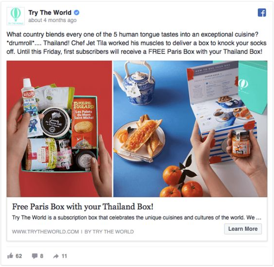
Wouldn't it be exciting if users could experience the sight and feel of a brick-and-mortar purchase through your ads? On Youtube, you can also see many similar video ads about people's happiness after receiving the delivery and opening the package, which are simple, direct, effective, and provide an incentive for customers to buy.
2.Display Contrast
Visuals have an impact, especially when high contrast ads increase click-through rates. The human eye is more sensitive to color, and high-contrast ads can catch people's attention at once. Some products will have variants, and some will offer customization services, so adjusting the contrast of each ad and making each ad contrast will have a good visual effect.
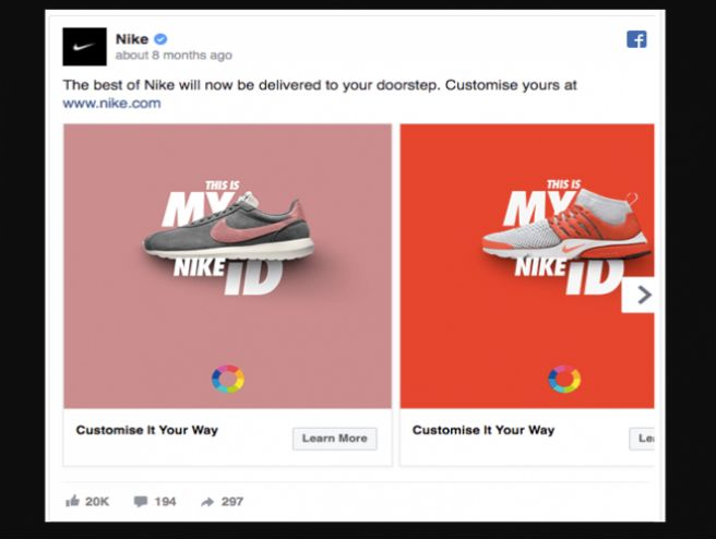
For instance, the Nike ad above uses a different background color for each pair of shoes, which creates a strong visual contrast and draws attention to the pair of shoes. The ad can also be swiped to the right to see more variants of the shoes. The visual presentation of this ad is great and will get the ad click-through rate up. Also, remember to put a product link in the ad. This strategy also works for customizable products, where different customization features can be used with different contrast, different colors, and different descriptions.
Another way is to show a comparison of the effect of the product before and after it is used. A before and after comparison allows customers to visually see how your product works and gives them a sense of excitement. Allowing the customer to intuitively see the product is important, but having feedback is even more important!
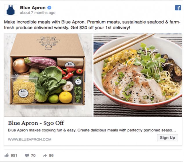
This Blue Apron ad, as shown above, is a comparison of the effect of fast food, with the left of the ad showing what it looks like when it is first opened and the right of the ad showing the finished product after the ingredients have been processed. Isn't this comparison image attractive?
There are many other examples, for example, you can show a before and after comparison of a skincare product, a decorative item that makes your bedroom unique, or a dress that makes you look more attractive. All of these can be made into comparison images and can be very motivating to customers.
Tips: Comparison images in ads are not allowed to be enlarged, otherwise they will be rejected or blocked.
3.Highlight the competitive advantages of your products
If your product is superior to a competitor's product, you should emphasize it in your advertising. If your competitor is a well-known brand, it will be more helpful to advertise. The average user will easily recognize a well-known brand, and the fact that your product is in some way better than a well-known brand will certainly give your customers a lot of confidence and a greater chance of buying your product.
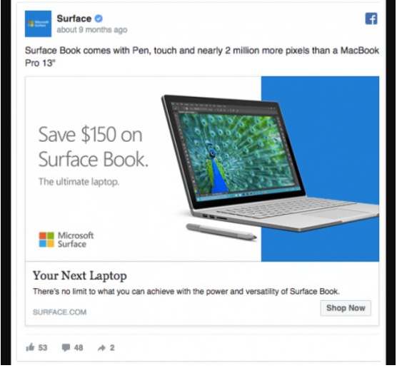
This is an ad for Microsoft Surface, in which it highlights the advantages over MacBooks - there are more pixels, which can help users save money. Since MacBooks is an already recognized brand, people usually think that MacBooks is better, but here Surface will get more customers for itself after highlighting its advantages.
4.Creating exclusivity and uniqueness in products
The ad below is a razor ad for the Dollar Shave Club. In the ad, it uses words like "our members", "club", etc. It is a small, exclusive group that shows a sense of superiority. It gives the customer a sense of wanting to join their group and be a part of it.
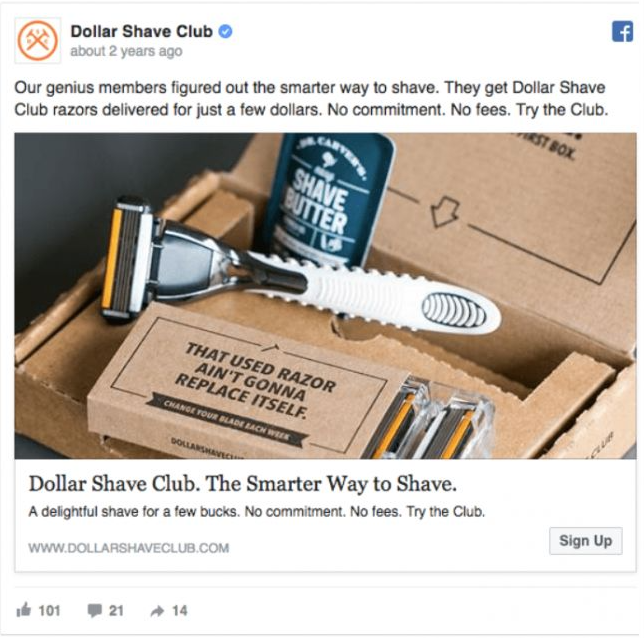
More importantly, you can utilize this exclusivity to make customers interested in exploring your brand story, user experience, and more.
These are some of the relatively new FB advertising strategies, but they won't work right away and may take a while to have a noticeable effect. Some of them may not be suitable for some stores, and it's up to you to test and research how to use them to get the best results. Most importantly, you have to think about what your customers want and be able to meet their ideas and solve their problems. Of course, you cannot just think about the thoughts of your customer, but sometimes you have to go beyond their minds to guide them to their needs and make them attracted by your ads.
Did you get it? Head over to
Shopifyspy
for moretutorials
and join ourFacebook group
to communicate with other dropshippers!
How to effectively solve Facebook advertising fatigue?
#1 Reasons and results of advertising fatigue
Why the audience has advertising fatigue:
1.The ad is displayed too frequently, causing users to see this ad every time they log in to Facebook.
2.Ads are competing with the photos and status of the user’s News Feeds.
3.The ad audience is already familiar with an ad and no longer feels fresh, so the click-through rate will drop.

Advertising fatigue can cause a series of terrible things, the most direct thing is to reduce the relevance score, which leads to an increase in cost per thousand impressions and cost per search result. It will ultimately reduce the number of results obtained by the campaign, thereby reducing the overall return on ad spend(ROAs).
#2 Facebook advertising performance indicators
Monitoring the effectiveness of advertising in Facebook Ads Manager mainly focuses on three indicators.
1.Frequency
People get tired when they see your ad too many times, which can seriously damage your Facebook ad effectiveness. Use Facebook Ads Manager to view advertising frequency. If your advertising frequency is more than three times, you need to adjust the audience of the ad group or change the creative. When the click-through rate drops and the frequency rises, it means that the same group of people is watching your ad repeatedly but not taking action.
When an ad is displayed, people who have clicked on the ad are less likely to click, and those who have not clicked will still not click. The advertisement has saturated the target market.
2.Operational behavior
The actions taken by the advertisement include: obtaining discounts, clicking links, installing apps, liking pages, sending activities, etc. within 24 hours after viewing the advertisement or within 28 days after clicking the advertisement.
If you want a higher conversion rate, then operational behavior is a very important indicator. You can use conversion tracking tools to track and understand it.
3.Click-through rate
The Click-through rate is calculated by dividing the number of times users click on the ad by the number of times the ad is shown. The Click-through rate is an important indicator of advertising fatigue. According to these two indicators, click-through rate and frequency, you can get the click-through rate and frequency that suit you. Then you can determine when you need to rotate the creative. Of course, you can also pay attention to other indicators, such as CPM, ROAs, correlation.
It is easy for users to experience fatigue after viewing an advertisement for a long time. Continuous innovation by rotating advertising can effectively solve the problem of advertisement fatigue. It is best to use a rotation strategy as soon as the advertisement shows signs of fatigue.

#3 Solutions to audience fatigue
If an advertisement is displayed for the same group of people for a long time, they are easy to be bored. Therefore we need to use some methods to keep the advertisement fresh to the audience.
1.Use reach coverage targets
The goal of the campaign Reach is to make the ads reach as many people as possible, and then the ads will be scattered to as many people as possible. Therefore, people are less likely to be fatigued with advertising.
2.Set the frequency cap
A sign of audience fatigue is that the frequency of advertisements is too high. By setting a frequency cap to limit the frequency with which the selected audience sees your advertisement, you can effectively avoid audience fatigue. The option “frequency cap” is used to set the frequency cap.
3.Exclude people who participated in the ad
When the frequency of the advertisement increases, the audience may have seen the advertisement over and over again. If we can exclude these people, it will reduce advertising fatigue.
First, use the Facebook pixel to create a custom audience of users who have visited the site in the past 60 days. And you can also create a separate list of people who have recently registered for the service or filled out forms.
Then, use Facebook Ads Manager to exclude audiences who have clicked on ads from the target list, and only serve ads to audiences who have not clicked on ads.
4.Keep the pictures concise and easier to understand
It is advisable to keep the ad image simple, and there are several ways to do this:
 Choose eye-catching images that are visually satisfying to zoom in, zoom out, or zoom in on.
 Do not include text in your images and avoid images with a lot of detail.
 Be sure to test the ad images separately to see which one works better.
5.Use clear call-to-action language to ensure that advertising is informative
The ad must have a clear and unambiguous call-to-action phrase, otherwise, the ad will be less effective. Test at least 5-6 call-to-action phrases with different ad materials to find the most appropriate one for the campaign rotation.
For example, the call-to-action phrase Sign up for our 6-week SEO accreditation course now can be derived in several variations, as follows.
 Spots for our SEO Accreditation course are disappearing fast. Enter now!
 Need a resume boost? Earn SEO Accreditation with AcmeCert!
 Now until September 31st – save 50% on our SEO Accreditation course
 Optimize your company’s internet presence with SEO Accreditation. Apply now!
 Boss breathing down your neck about ROI? Sign up for our 6-week SEO Accreditation
In addition to making changes for the ad elements, you can also change the target audience.
If you are very optimistic about your ad material, but the click-through rate is still decreasing and the frequency is still increasing, try changing the target audience stats before you publish your ad. Changing your target audience will keep ad fatigue to a minimum, while also maintaining a steady stream of clicks.
6.Increasing the value of advertising offers
It is also possible to increase the attractiveness of an ad offer by upping the value of the ad offer. The different offers can also be tested separately so that we know which offer has the best results.
For example, the first subscription offer of the New York Times is "99 cents for 4 weeks", while the second offer is "8 weeks of free use", the value of this offer will have a great impact. Because it is easy for people to make a decision when they have a comparison to make.
7.Find the ad space that offers the best results
When creating an ad, you have the option to advertise in all eligible display locations on Facebook, Instagram, and Audience Network. However, not all ad posting locations are available for all ad groups.
Select the Campaigns view of Facebook Ads Manager to see which display locations have gotten the best results over the past 30 days. To view the results, you need to find the display ad positions that worked best and worst.
8.Connect with your customers
Providing valuable information and useful guides to your audience, rather than direct sales promotion, can build interest and trust in your brand. There's a saying that the best way to sell is not to sell. If you not only use Facebook ads for direct sales but also use it to nurture prospects and connect with customers, you can make the most use of Facebook ads and achieve dual advertising goals.
There are many ways to achieve this such as creating eBooks, sharing blogs, giving away completely different types of products, and using these to increase customer subscriptions, which helps increase prospects, build brand awareness, and boost sales.
That's all we have to share today, so head over to
ShopifySpy
for moretutorials
. You can also join ourFacebook group
and share it with other dropshippers!
What do we do if the natural ranking for a keyword is tied with the ad position ranking?
Is it a waste of advertising costs to have these two positions side by side?
If this happens, do we need to lower the bids on the ads to stagger the two positions?

The potential for waste from the juxtaposition of two positions is not a fundamental basis for action; it is more worth considering and weighing the data reflected in the advertising data itself, as well as the overall product build strategy.
The core of an ad campaign's adjustment and optimization is based on conversion rate and ACOS(Spending on advertising as a percentage of advertising sales) high or low. Regardless of the ad position, as long as the two metrics of conversion rate and ACOS are OK, it's generally not particularly recommended to adjust the ad bids for these variables. An ad that was performing well can often get worse and worse due to over-adjustment and, crucially, once it gets worse, it's hard to get it back to its original state.
Some sellers may be concerned that ranking for natural keywords and ad space together will result in wasted advertising, but is it so?
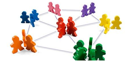
The first thing that should be noted is that there are a finite number of positions on Amazon's homepage, and more resources a seller got means fewer resources for others. According to the logic of the stock market pie division, you get a larger share of the cake, the share of competitors will necessarily decrease. In this way, your living space is enlarged and your competitors' living space is compressed. Just like Lei Jun said, competition is to "drive yourself crazy, drive the opponent to death". And while your conversion rate and ACOS are cost-effective, without having to drive yourself crazy, you can happily count orders and make money while pushing your competitors into misery, so why not?
Another situation is that although the keyword natural ranking and ad position ranking are on the first page, but in terms of advertising data, the ad conversion rate is not high, ACOS is very high. At this time, you can lower the bidding price of the ads by saving costs and increasing the input/output ratio to make the ad position relatively low, such as down to the second page. With ad space lowered to the second page and lower ad bids, CPC(Cost Per Click) costs naturally become lower. If a certain conversion rate can be maintained, the ad ACOS percentage will generally decrease, bringing it closer to your gross margin. When the ad ACOS value is at or below your gross margin, the direct input/output ratio of the ad is cost-effective.

Of course, the actual operational situation is more likely to be that the ad position drops from the first page to the second as the ad bids are lowered. At this point, a new situation arises in ad performance - the number of clicks decreases, the total cost of the ad decreases, while the conversion rate and the number of ad orders have decreased. With the decrease in the number of ad orders, the total number of orders affecting the Listing decreased, which in turn led to a drop in BSR(Best Seller Rank) ranking, what to do in this situation?
Don't rush to bring up the ad bids again, but instead drive up sales by lowering the price of the product in a price-sensitive manner, thus keeping the total number of orders the same or improving, and ensuring a stable or steadily increasing BSR ranking. This adjustment will have a longer-term effect on a Listing - an increase in the percentage of natural orders, a decrease in the percentage of advertising orders, and a decrease in the dependence of sales on advertising. This is more conducive to maintaining the weight of the listing.
In operations, when faced with advertising, a holistic view is a must, focusing not only on the ad but also on the overall build. Advertising is just a tool for operations, and in the pursuit of bringing in orders, it is more important to focus on the input-output ratio. If there is a plan that can both ensure savings in advertising costs and promote total sales and BSR ranking rise, take it seriously.
Did you get something today? If you want to learn more, you can go to
ShopifySpy
for moretutorials
. Also, we sincerely invite you to join ourFacebook group
and share the conversation with other dropshippers!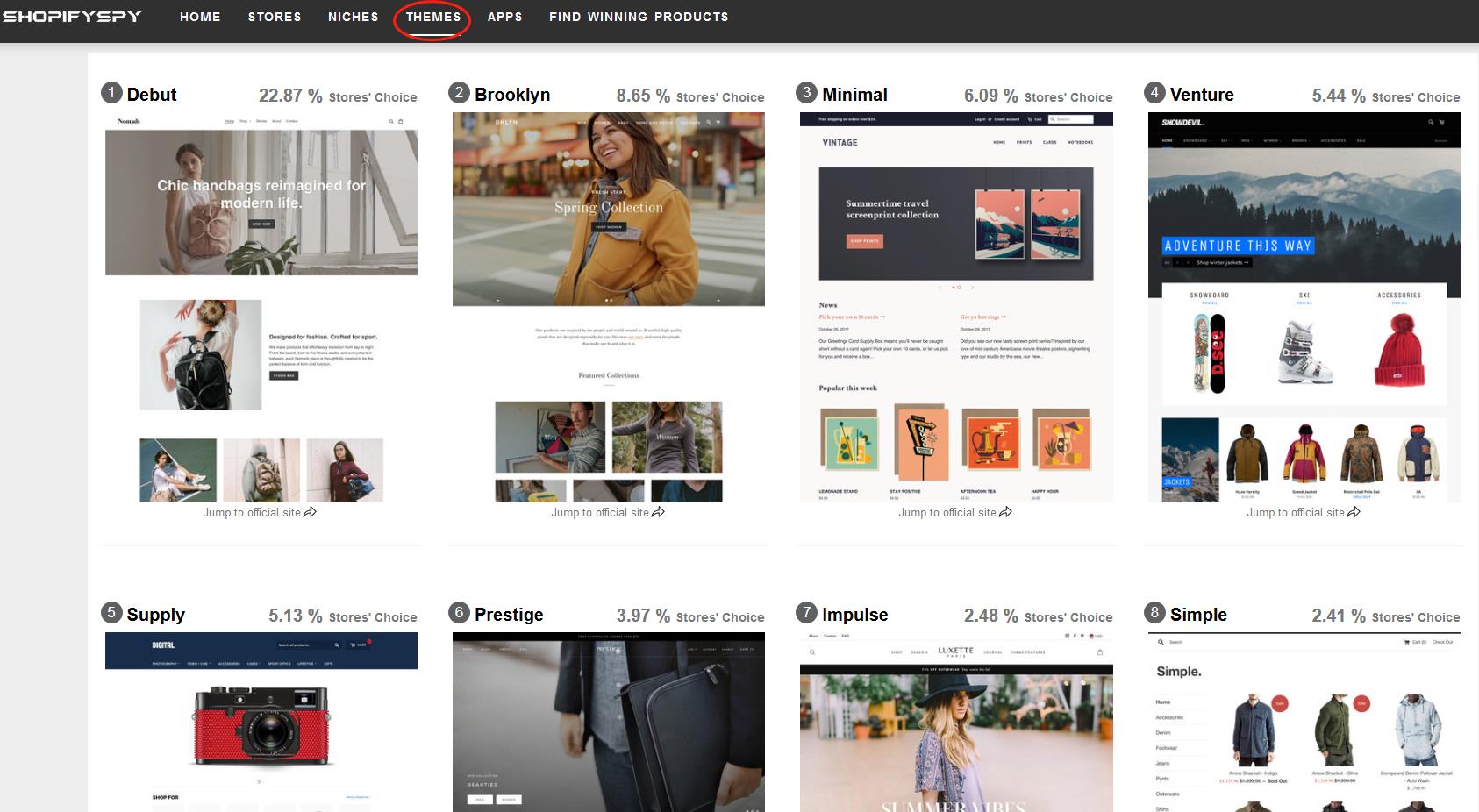
Top 10 Hottest Shopify Themes for Inspiration in 2020
Shopify themes
is the first and crucial step to start your Shopify business. Here are the top 10 Shopify themes for your reference, according to Shopifyspy. Hope it is helpful.
#1
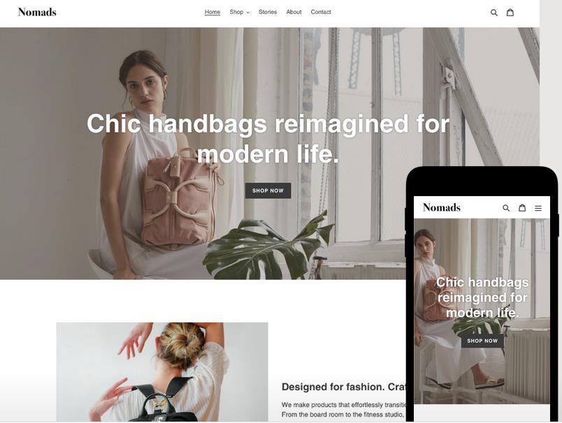
Debut
* 22.87 % stores' choice
Theme styles: Default, Light
Highlights:
* Ideal for small catalogs or stores with a small number of products
* Big promotional banner to highlight your products and their valuable info
* Predictive search to display live search results and quick links for product pages.
* Customer testimonials to promote your products by sharing your customers' comments and quotes.
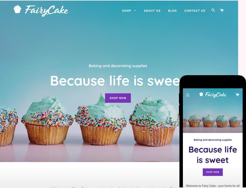
#2
Brooklyn
* 8.6 5% stores’ choice
Theme styles: Classic, Playful
Highlights:
* Tailor-made for modern stores with a focus on brand imagery.
* Its dynamic product grid allows the product layout to change automatically according to the number of display.
* Slide-out cart enables the customers to easily add to their cart without leaving the current page.
#3
Minimal
* 6.09 % stores’ choice
Theme styles: Vintage, Fashion, Modern
Highlights:
* A simple, concise design to keep the focus on products
* Product filtering allows customers to filter products by type, and sort by best sellers and price on the collection page.
* Product image zoom function enables users to have a closer look and extra product details.
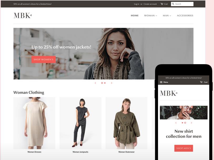
#4
Venture
* 5.44 % stores’ choice
Theme styles: Snowboards, Outdoor, Boxing
Highlights:
* Venture is tailored to large product catalogs or stores with a large number of products.
* A multi-column menu makes it possible to show product details and images in a drop-down menu.
* You can promote a single featured product by highlighting it front and center on your home page.
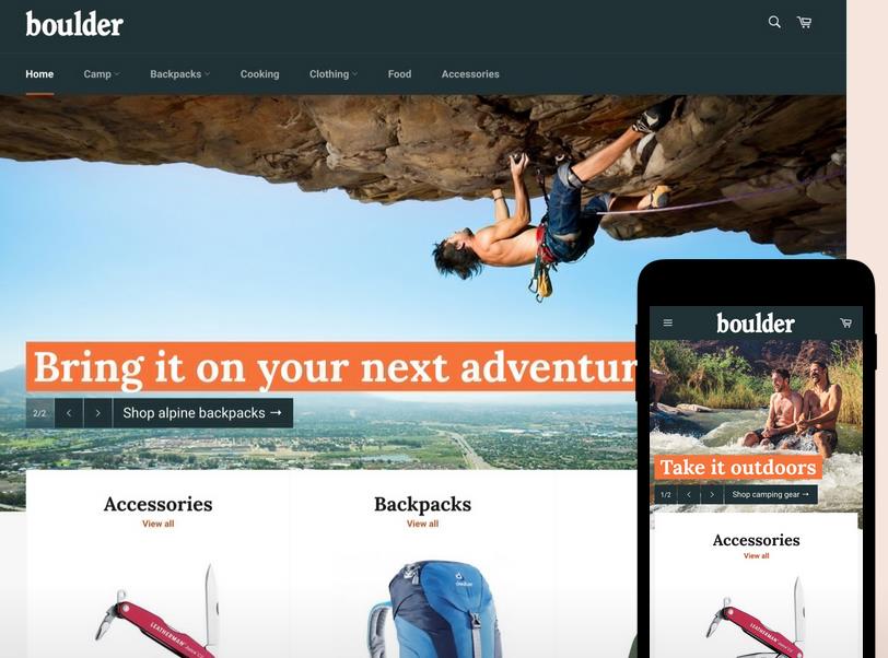
#5
Supply
* 5.13 % stores’ choice
Theme styles: Blue, Light
Highlights:
* Built for large catalogs or stores with a large number of products.
* Neatly classifies your products to increase conversion rates
* Collection filtering in sidebar allows customers to filter collection pages by brand, price, and other customized options.
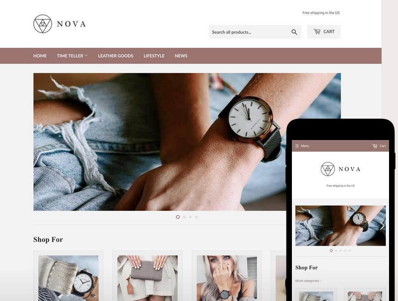
#6
Prestige
* 3.97 % stores’ choice
Theme styles: Allure, Couture, Vogue
Highlights:
* Ideal for premium, high-end brand appeal
* Image hot-spot linking: Tag images by dragging hot-spots for easier in-context discovery of your products.
* Excellent for visual storytelling, owing to high-resolution product imagery and a built-in timeline tool.
* Quick buy: Allow customers to quickly add items to their cart without leaving the product page.
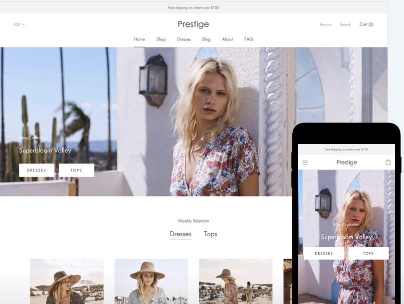
#7
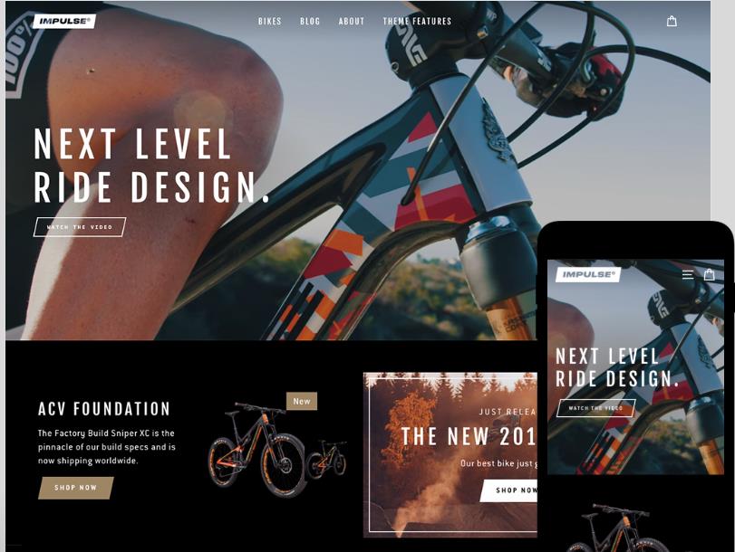
Impulse
* 2.48 % stores’ choice
Theme styles: Modern, Vintage, Bold
Highlights:
* Big banner and imagery for awesome visual experience
* Multiple videos on your home page for story telling
* Custom collection sidebar filters to enable customers to browse and filter products using custom filters and tags.
* Create custom promotional content on collection pages.
#8
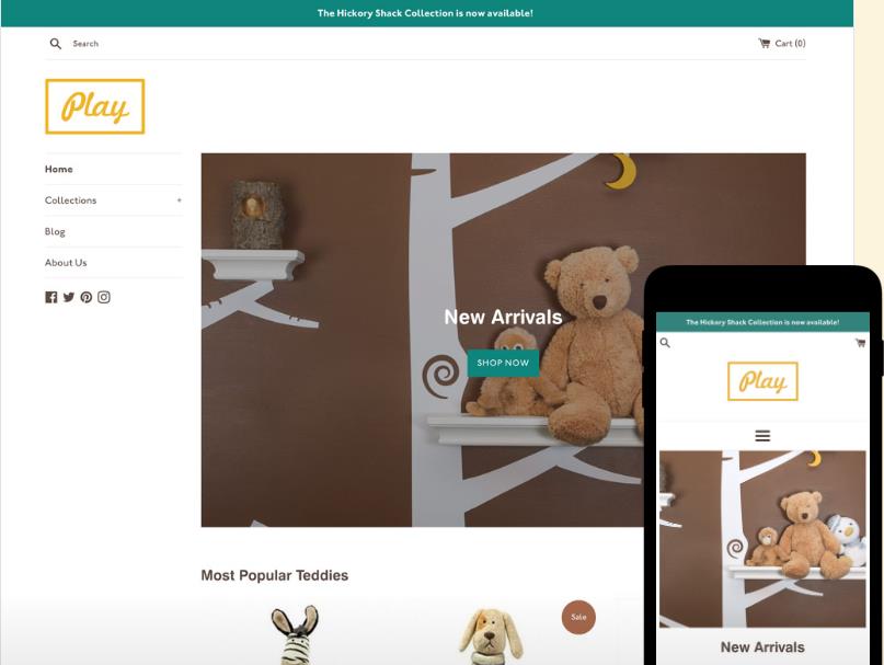
Simple
* 2.41 % stores’ choice
Theme styles: Light, Beauty, Toy
Highlights:
* An accordion-style sidebar menu for easily displaying your products and collections
* Product image zoom makes you access to products with a closer look.
* Image animations: Product and brand images animate into the page to create a sleek, transition effect.
#9
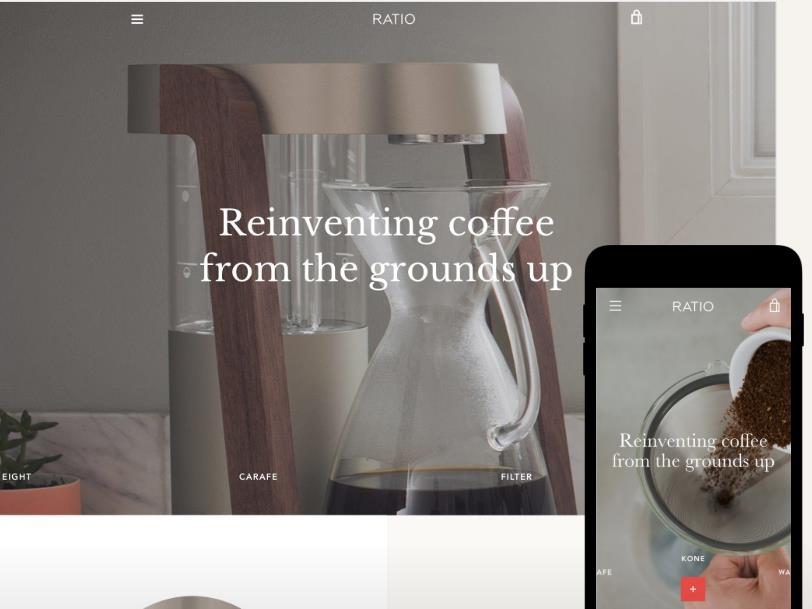
Narrative
* 2.28 % stores’ choice
Theme styles: Warm, Light, Cold
Highlights:
* Narrative, as its name, is perfect for visual storytelling
* Ideal for stores with a single product, or a small number of products.
* A full-width layout & high-resolution imagery for better visual display.
* Vertical slideshow on the home page for smooth browsing experience
#10
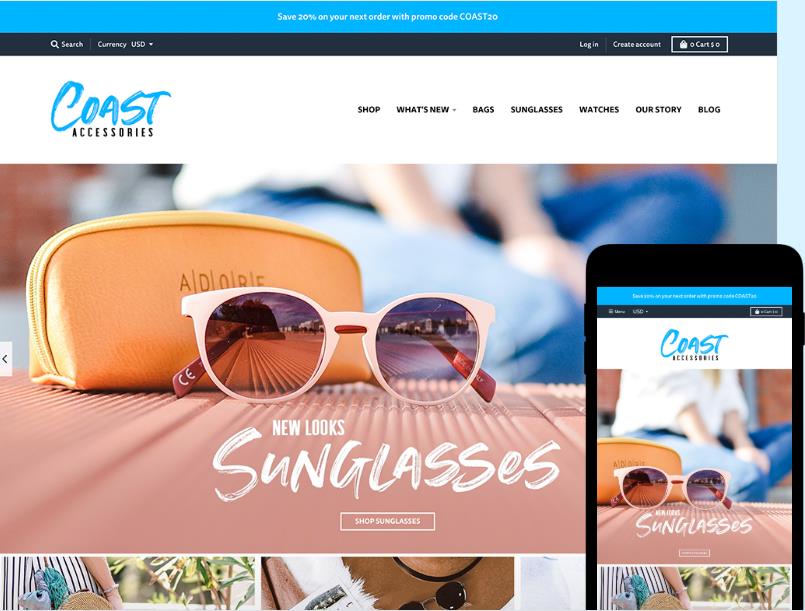
District
* 1.91 % stores’ choicewans
Theme styles: District, Energy, Coast
Highlights:
* A big and eye-catching banner highlights your featured or flagship product via a prominent homepage video or slideshow
* Display color swatches on your product page to showcase available product colors.
See more themes and follow up the latest pop themes via